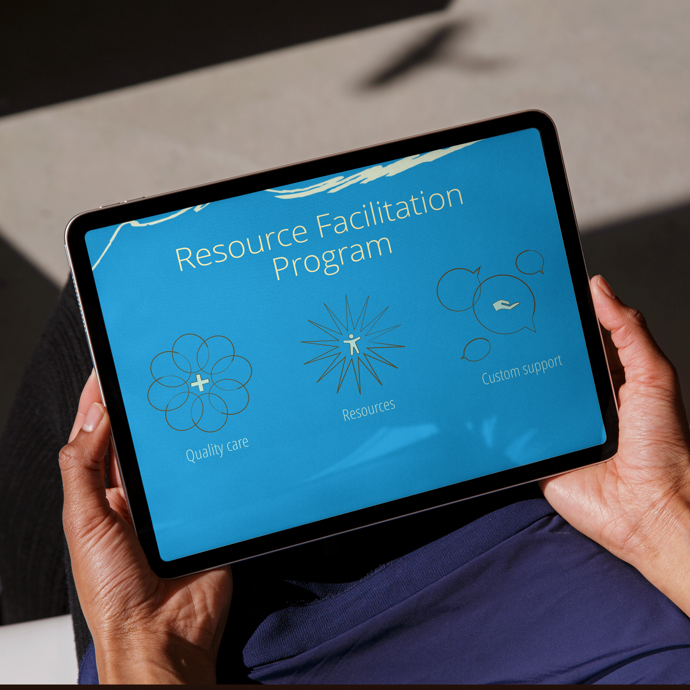
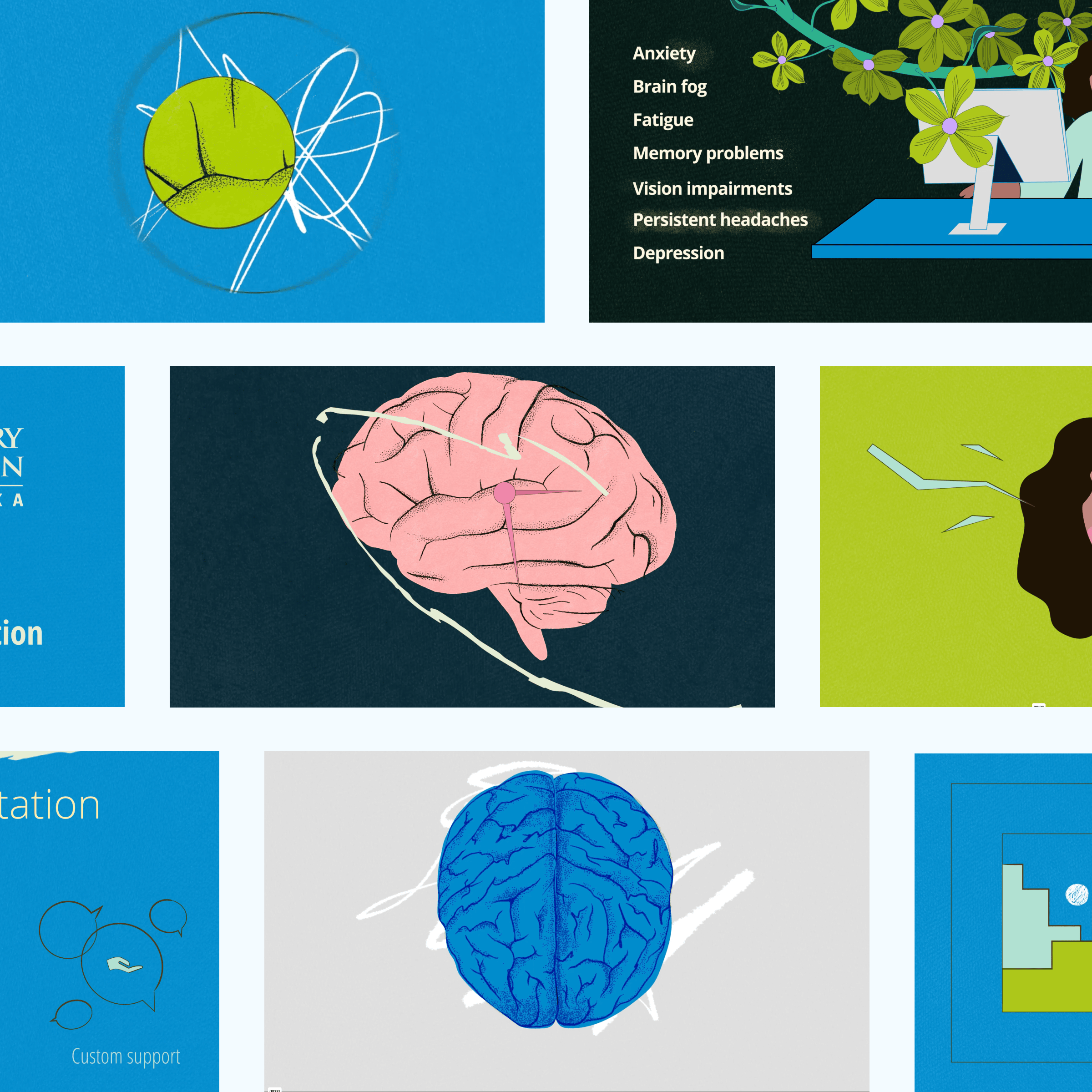
Overview
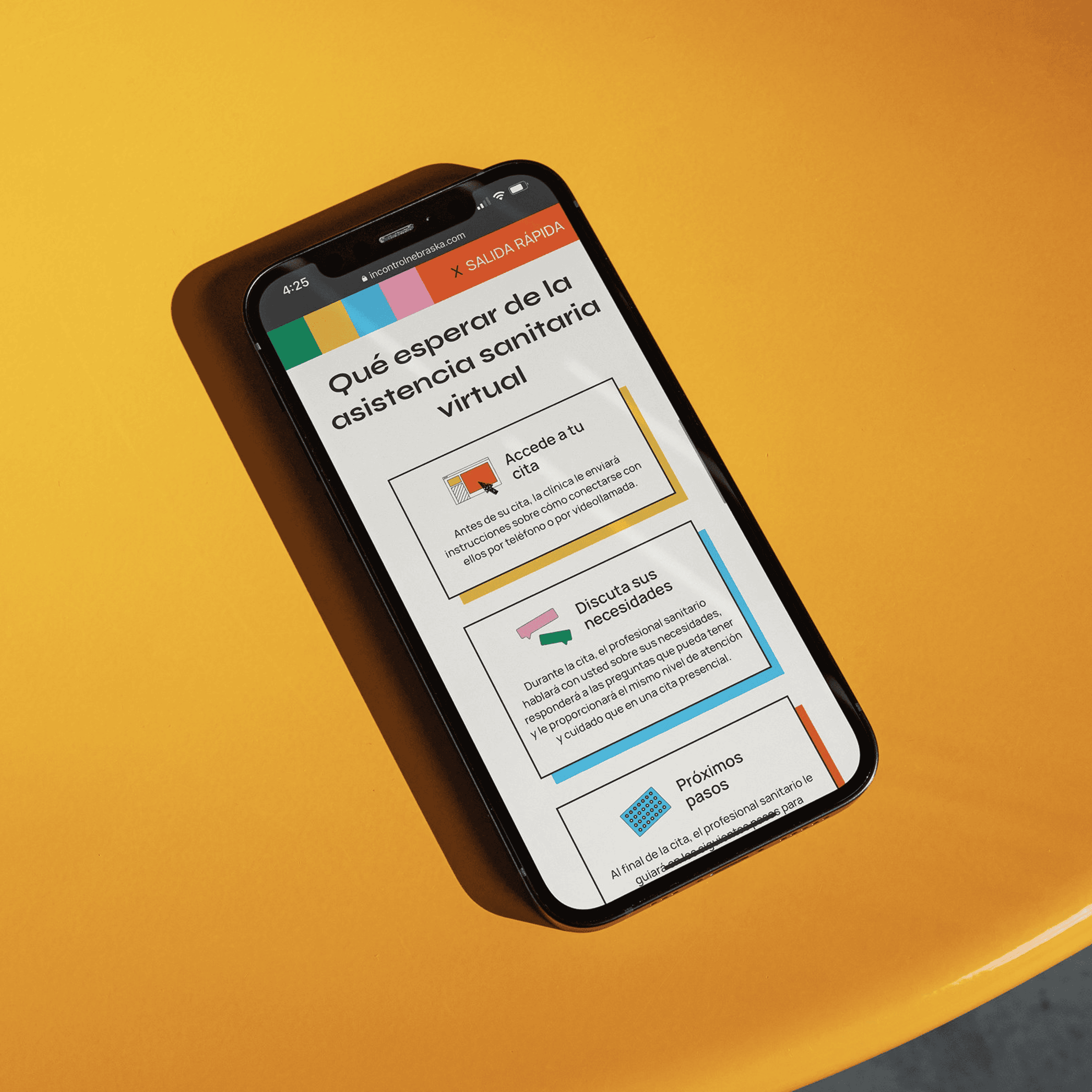
When the Brain Injury Association of Nebraska needed two explainer videos updated for a rebrand, the original files were gone — so both were rebuilt from scratch. That constraint became an opportunity to rethink pacing, illustration style, and visual cohesion across the full system. Warmer color, cleaner typography, and more human visuals brought the content closer to the organization's updated identity. The result feels like it was always meant to look this way.